Orangetown Diner
Objective
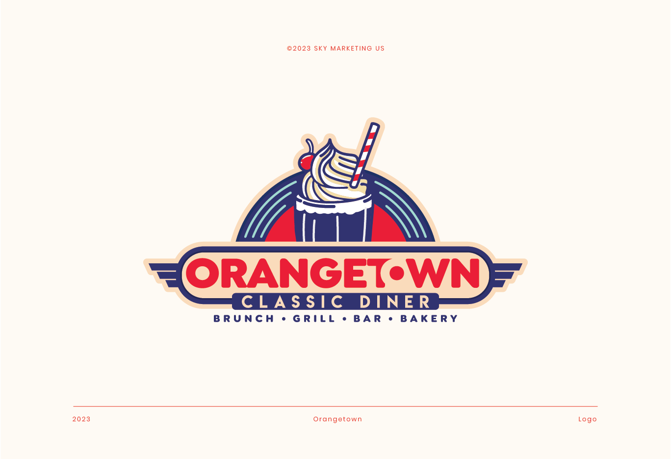
The objective of designing the logo and creating the branding for "Orange Town Classic Diner" was to establish a strong, recognizable visual identity that evokes the nostalgic charm of classic American diners. This includes:
What we've done


1. Initial Consultation and Research
- Client Meeting: Understanding the client’s vision, goals, and target audience. Discussing the diner’s unique selling points and desired brand image.
- Market Research: Analyzing competitors, industry trends, and successful diner brands to gather inspiration and identify opportunities for differentiation.
2. Concept Development
- Brainstorming: Generating a variety of ideas and themes that reflect the classic diner experience. Considering elements such as retro aesthetics, iconic diner imagery, and a welcoming atmosphere.
- Mood Boards: Creating visual collections of images, colors, fonts, and styles to convey the desired look and feel. Sharing these with the client for feedback and direction.
3. Design Elements
- Sketching: Drawing initial logo concepts by hand, focusing on key diner elements like milkshakes, jukeboxes, and classic car motifs.
- Digital Drafting: Converting sketches into digital formats using graphic design software. Experimenting with different layouts, fonts, and color combinations.
4. Typography and Color Selection
- Font Choices: Selecting typefaces that evoke a nostalgic diner vibe. Combining bold, easy-to-read fonts with playful, retro styles.
- Color Palette: Choosing colors that convey warmth and energy. Opting for vibrant hues like red, blue, and cream to create a lively and inviting atmosphere.
5. Logo Creation
- Icon Design: Crafting a central icon, such as the milkshake with a cherry and straw, to symbolize the diner experience. Ensuring the icon is simple yet distinctive.
- Integration: Combining the icon with typography in a balanced and harmonious way. Ensuring the logo is versatile and works well in different sizes and applications.
6. Review and Feedback
- Client Review: Presenting the initial design drafts to the client. Gathering feedback on what works and what needs adjustment.
- Revisions: Making necessary changes based on client input. Refining the design to align more closely with the client’s vision.
7. Finalization
- Polishing: Fine-tuning details, ensuring the logo is polished and professional. Preparing various logo formats (color, black and white, high resolution, etc.).
- Brand Guidelines: Creating a set of guidelines that include color codes, typography rules, and instructions for logo usage. Ensuring consistency across all brand materials.
8. Brand Application
- Stationery and Marketing Materials: Applying the logo and branding elements to business cards, menus, flyers, and other materials.
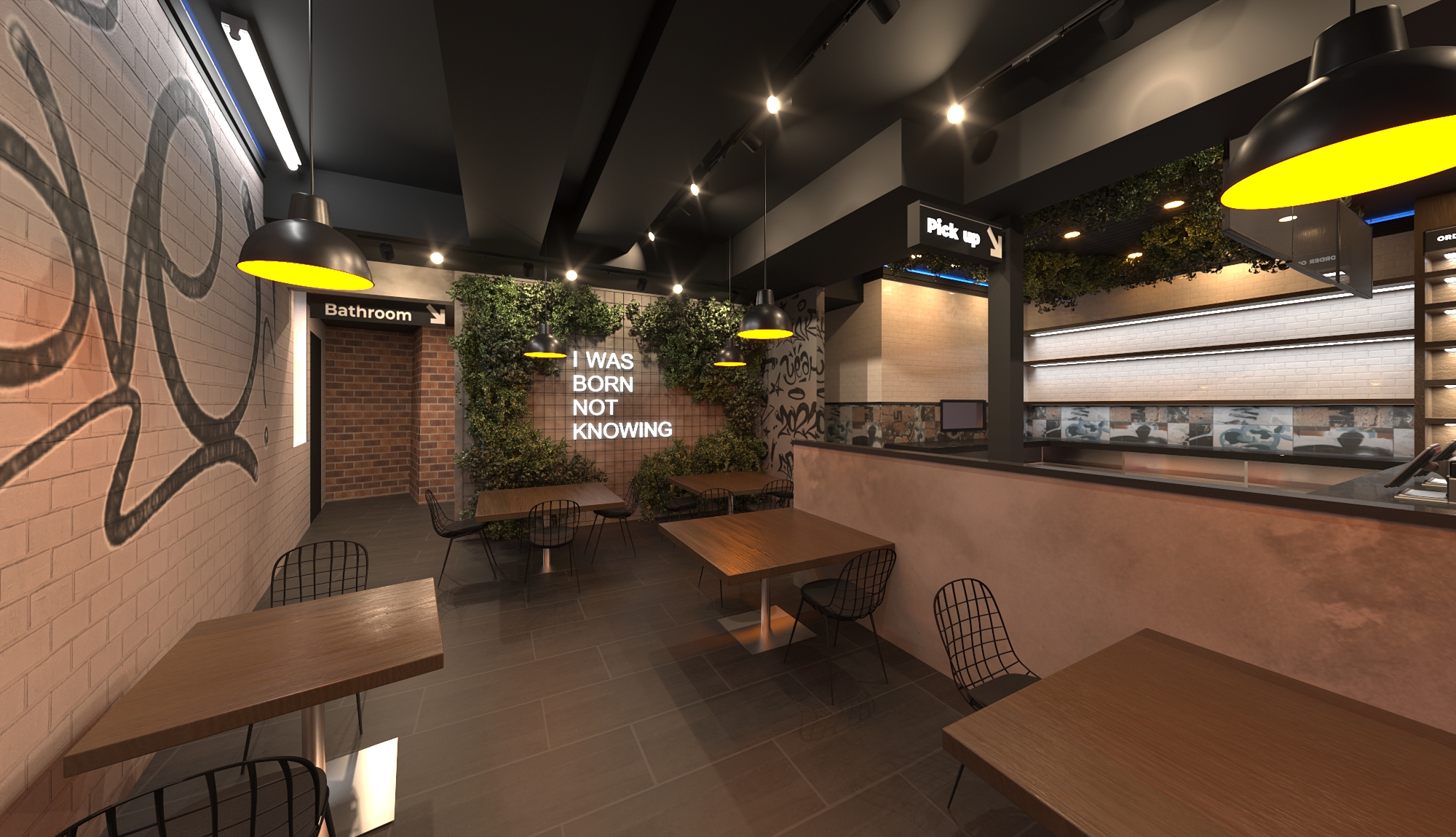
- Signage and Online Presence: Designing exterior and interior signage, as well as social media profiles and website graphics. Ensuring a cohesive look across all platforms.
By following this creative process, the team was able to develop a strong, cohesive brand identity for Orange Town Classic Diner that effectively communicates its nostalgic charm and appeals to its target audience.
Related Work
View All
0
1
2
3
4
5
6
7
8
9
0
0
1
2
3
4
5
6
7
8
9
0
0
1
2
3
4
5
6
7
8
9
0
%


.png)
